
Food & hospitality / 2026
Het Soepboerke
A warm welcome, made digital. An editorial website direction with a searchable menu and practical visiting information.
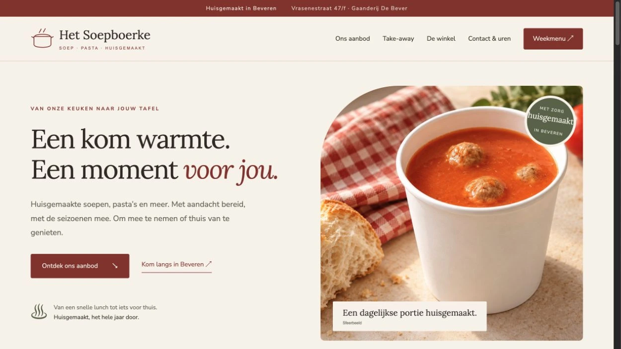
01 / THE DIRECTION
Bring the kitchen
into the first impression.
Warm ivory, muted red, serif typography and food imagery shape the concept. The homepage introduces the shop, then leads into the menu, takeaway options and practical visiting information.
The design pairs large visual moments with a quieter structure for finding products and information.
02 / THE EXPERIENCE
Explore the menu.
Find what you came for.
The working demonstration includes category filters and menu search. Longer lists expand on demand, while visit information and the weekly-menu link remain available from the navigation.
The full menu and practical information sit alongside food photography and shop imagery. Generated atmosphere images are identified within the demonstration.
03 / THE PROTOTYPE
From visual direction
to a working page.
The working preview connects the visual direction to menu discovery and practical visiting information, with the same reading order across desktop and mobile.
Explore the working preview ↗Working preview opens in a new tab.
MOBILE / IN THE BROWSER
From first impression
to finding lunch.
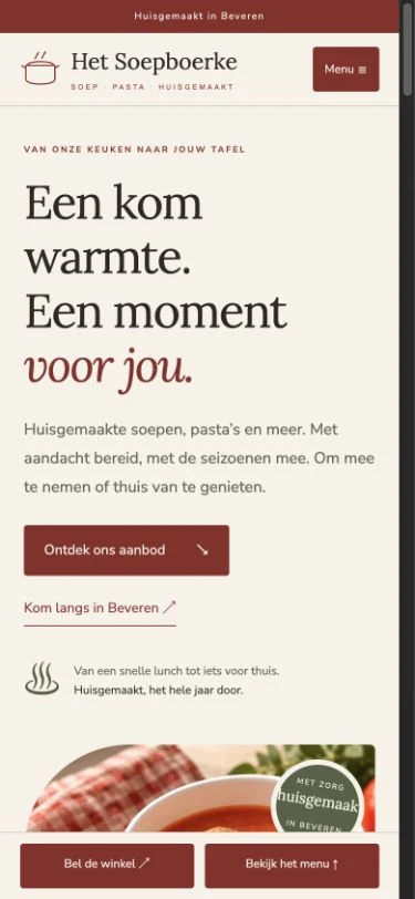
The mobile layout keeps the introductory story and food imagery in a single reading order, with direct routes to the menu and visiting information.
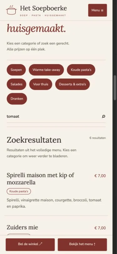
Searching for “tomaat” returns matches across the full menu, including dishes from different categories. Visitors can browse by category again when they want a broader view.
A different business.
