
Architecture & culture / 2026
Fieldnotes
Space, light and a different way of looking. An architecture journal shaped around places and perspectives.
01 / THE STORY
A journal for people
who notice places.
The brief for Fieldnotes brings architecture, culture and everyday observation into one editorial identity. Its subject is the way places are experienced: the shadow across a stairwell, a curve in concrete, the light that changes a familiar room.
The design gives those observations a publishing format. Photography sets the scene, while type and short editorial cues create a route into the stories.
02 / THE DESIGN QUESTION
Make room for the image.
Give the reader a way in.
Architectural photography often needs scale to communicate. At the same time, a journal needs a recognisable identity and a clear reading order. The design balances those two demands.
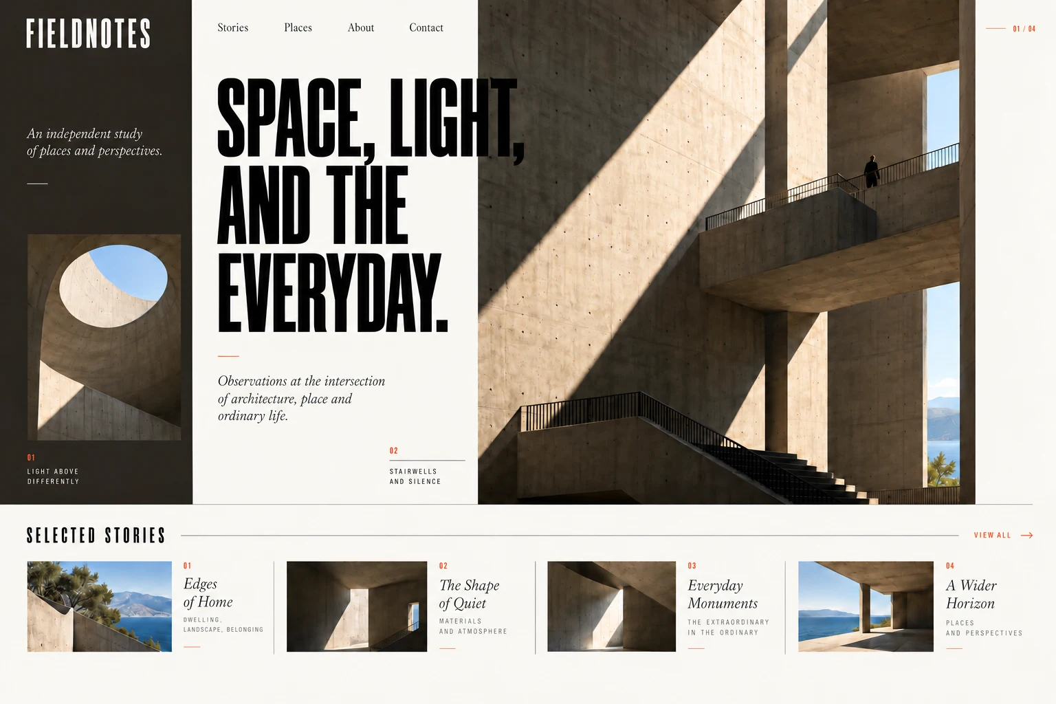
A large architectural image occupies most of the opening composition. A distinct side column holds the publication’s name and a supporting detail, while the central headline connects the image to the editorial theme.
03 / THE VISUAL DIRECTION
Concrete, charcoal
and natural light.
Warm ivory and charcoal sit close to the tones in the photography. A small rust accent marks indexes and reading cues, keeping the visual emphasis on the places being documented.
Tall condensed headlines establish the publication’s voice. Serif captions and introductory passages bring a different pace to the reading experience, balancing the more graphic display type.
04 / THE WEBSITE STRUCTURE
An editorial front page.
A collection of perspectives.
Stories and Places provide two ways into the content: follow an article or explore a location. About introduces the publication, while Contact offers a direct route for inquiries.
The selected-stories row extends the opening theme into several articles. Thumbnail, headline and category work together so each item reads as an editorial entry rather than a generic content card.
05 / THE DETAILS
A rhythm between
wide views and close observations.
The large stairwell photograph is paired with a smaller view of a curved wall and skylight. That shift in scale reflects the journal’s subject: the wider setting and the detail that makes someone stop and look.
Fine rules, compact indexes and a repeated column structure tie the homepage to the article layouts. The design can extend into long-form stories with full-width photography, captions and readable text columns.
A different business.
